Sunday, 16 August 2009

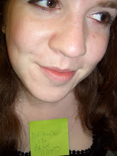
Uni Art 08/09 - Embroidery


As part of my own self directed project I decided to look at the use of craft.
I used embroidery to explore themes including portraiture,
female representation and juxtaposition.


Uni Art 08/09 - Fish face

As another introductory project at the start of 2nd year we had to create a performance, based on our bodies and involving some kind of sculpture. Due to my crippling fear of performing in front of people, and my desire to try new things, I made a short film.

It can be found - here

(Uni) Art 08/09 - Group Exhibition

Group exhibition.

Given a room, 2 weeks and free rein we decided to use our project to highlight the room's qualities rather than hide them. We also brought in themes of destiny, fate and individuality.
The result was this. Each of us having complete control over our own line, with the only restrictions being it had to start in the doorway and leave via the window.
The path across the room was completely up the individual.


Wednesday, 27 August 2008

My first publication!

Over the summer holidays I applied to my local theatre for any Art Journalist opportunities.
I submitted a review of Endgame, which I watched at the Everyman Theatre in Liverpool for part of my Literature course at uni, and they took me on as Community Critic!
The play I was selected to review was called Six Characters in Search of an Author. Which, excitingly, was featured in the Telegraph's Top 5 the week before the press night. This is their review of the play.

http://www.telegraph.co.uk/arts/main.jhtml?view=DETAILS&grid=&xml=/arts/2008/07/10/btsix110.xml

And, rather more excitingly as far as I am concerned..
Here is mine

http://www.cft.org.uk/content.asp?CategoryID=1228

I would really appreciate any comments, it is my first review so I would love any feedback : )

Promises

New Uni-year resolution = More posts.
This place is going to become my online record of my art and writing.
So I should begin with filling in the gap.
1st year of uni is over.
Projects were slightly uninspiring, especially after the more intensive nature of Art Foundation last year.
They included Deckchair Tourist Guides, Carrot Flutes and Alternative Portraits.
If I find anything I like i'll post them.
On the plus side we did a mock-up of the Turner Prize (as it was in Liverpool this year) and my group (who represented Nathan Coley) faced the judges and won! So I have a fake cheque for £25, 000. But better than that I have made some awesome friends..

Wednesday, 24 October 2007

Update

Sorry this is going to be alittle out of style for me.
I'm now in Liverpool, very happy, amazingly settled.
Honestly uni isn't the scary hairy monster people think it'll be.
Its ace.
Of course you miss home.
I've missed home.
Twice.
Which is alot less than most people but the truth is i know it'll all be there when i go back or when i need it.
Literature is rocking my academic socks.
4 weeks, 3 plays.
Tough but terrific.
Art,
fustrating beyond words.
But it'll improve.
And so will I with my internet-frequency.
Promises x

Thursday, 2 August 2007

Screen Printing


I know it has been ages since my last post, but i've been busy enjoying all the things i didn't do whilst at college, like socialising :)
I'm planning to slowly put up all my back work from college so when i start Uni in September i can put work up as it happens..


Here are a collection of screen prints i produced whilst planning the chair i posted below. The idea was to play with simple but iconic war imagery in alternative contexts. I would really appreciate any opinions : )


The print above to the left is a simple linear gun print using a mixture of greens and yellows, i like the faded elements and the clarity of image.

The second print is of the reverse of this image and combines green and purple. I like the varied result of clear and faded guns and the sparadic distribution of colour.


The pink was chosen to provide the biggest contrast in imagery. Whilst i prefer the green i think the pink makes a bigger statement as it fuses the generalized gender stereotypes both components depict. I also prefer the the use of a number of colours in the other two gun prints. I think one colour makes it appear flat.


These prints were all created in my first session of print making. So despite the views i have just expressed i was generally really pleased with the images i created. I really recommend the process to anyone who needs to play with image and technique as it is easy to do and if done productively can produce mountains of work. It also enabled me to print the material for my chair, in a relatively labour-free way, other techniques would have been more time consuming and complicated.


Whilst the gun is probably the strongest of all war icons i wanted to experiment with alternatives.
So gasmasks. I realise i have written ALOT already so this is going to be brief...

Pink and green, continues male/female idea, like the depth created.

Blue and yellow, striking image but not conceptually strong.


Finally, orange and green. Abstract finish due to use of offset linear print. Like the colours together and the fresh result.

All screens were made from drawings of mine, scanned into photoshop and repeated. Then the colours inversed if necessary.


Hope you like : )
Happy summer to all! x